

When we think of a new corporate image, we normally think of updating a logo, its colors and font. However, when creating a company’s image, one must consider who the company is, how it wants to be perceived and how it wishes to be recognized. The business’s objectives must be aligned with this new image, it must include the culture of the countries where it resides and encompass a consistent and unique vision that simultaneously gives freedom to each of its brands or companies.
Our company’s project for a new identity began with a call I received from Mr. Gustavo De la Garza Flores where he told me they wanted to consolidate all Marcatel’s companies under one brand, to present them as a group. They decided to call it Vívaro.
To achieve this great feat, we began by reviewing our past, present, and future attributes.
Our past begins with Don Gustavo M. De la Garza Ortega and a great idea that prospered and led him to face challenges and extraordinary experiences. I recommend you delve into the details of this remarkable story through his book "Stubbornness vs Persistence.”
Years later, thanks to the assembling and direction of an extraordinary team, a constant and clear capacity for growth was achieved. Mr. Gustavo De la Garza Flores extended Marcatel's geographic presence in Canada to Mexico with the purchase of XSN and continued to grow towards Chile with the TVTEL partnership. Additionally, he dabbled in esports and the telecommunications branch became just one part of the group. Marcatel had ceased to be just a telco: it was clearly evolving into something more.
Gustavo De la Garza Flores, like every two years, shared the company’s medium- and long-term mission, vision, and values, now with an internal and external perspective. He decreed a new manifesto: “To transcend, creating extraordinary experiences and transformative solutions.”
Additionally, he presented the strategic pillars on which we would focus our efforts. With this information, we had everything we needed to start the development of our new identity.
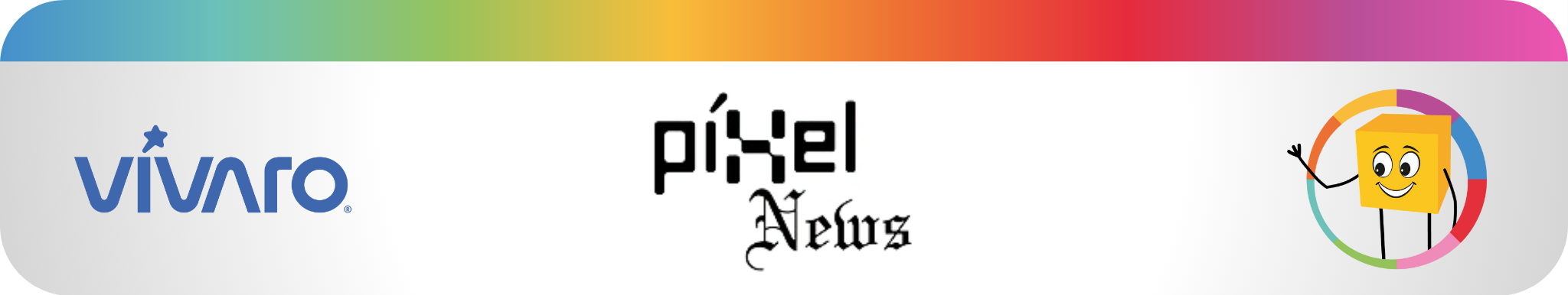
“Vívaro” is a great word. It is short, simple, and has oomph. We knew the design should reflect the technological essence of the brand, and we decided on a single thickness from start to finish to show strength, consistency, and a sense of innovation.
The letters "VIV" should be close together, filling the space between them well; we liked that the "A" looked like the “V”, simply inverted 180º. On the other hand, a capital “R” was too fancy and stood out: we decided to make it lowercase so that it would maintain the same rhythm and not have priority over the other letters. We set only two inclinations, 110º to the left and 70º to the right.
Something that fascinated me is that the graph looks simple, but it took weeks of sleepless trial and error to find the right harmony and balance. Every little detail was considered and a recurring meeting with Don Gustavo, Gustavo, Lino, and Ignacio helped in perfecting the idea and discarding the proposals that did not work.
It was important to find a middle ground between appearing technological and timeless. If the logo looked hyper technological, it was unlikely to survive the test of time and would become obsolete in a few years.

Once we decided on the letters, we placed it in a rectangle grid we liked. But still, the extraordinary element in the logo was missing. That brightness we have in our search for excellence and our desire to transcend had to break the monotony and ordinariness of the figures.
To achieve this, we replaced Marcatel's yellow sun with a five-point star, softening and rounding its edges to better integrate it with the font. We liked that the star replaced the word’s accent, mimicking its grammatical importance with the responsibility of becoming the logo’s icon: the accent is what highlights the most important syllable in a word, naturally stands out, places emphasis and marks where the greatest intonation should be expressed.

We found that stretching one end of the star gave it movement and creativity, it broke up the font’s monotony. Besides, a star’s meaning is positive in different cultures and represents us quite well. Having it lean to the right gives a positive connotation, signifies growth. In superstition, a star is a symbol of making a wish; in religion, it was a star that guided the Three Wise Men. It represents the search for the magical and it is a star that emits light in the darkness. It was certainly part of our identity.
With the logo complete, we moved on to colors. Marcatel's yellow had worked well, innovating the color hues of technology companies at the time, and continues to be well positioned. But we felt that if we maintained the color, it would continue to be Marcatel and that was not part of the plan. "Vívaro" is a global brand and we had to think about its worldwide projection.
In color psychology, blue represents freedom, loyalty, harmony, truth, and seriousness. And its color range did not repeat among the other companies. Also, it is the natural and connotative color of a star at sunset.

We had come a long way, but an even greater challenge remained. Gustavo's vision was to group all the companies or identities into one, but each maintaining their own essence.
For this, we studied behaviors and architectures of the most representative brands worldwide and how they relate to each other. We studied their “whys”, their success stories, as well as common mistakes. In our case, we had to consider two characteristics that set us apart from other global brands: all our companies have their own prestige and a positive perception by employees, customers, suppliers, and prospects.
After ample analysis, we chose a monolithic brand architecture. In it, all the brands depend directly on each other and are as similar as possible. It is a very aesthetic style, simple and easy to understand.
It also allows you to develop additional sub-brands and to concatenate attributes. This type of architecture multiplies brand recognition and builds trust by communicating that the brand belongs to a larger group that dominates the market and has been consolidated over time.
Monolithic architecture is brave architecture: few companies dare to make it their own. It is a great responsibility and requires full confidence in the talent of its people since the prestige of one company extends to the others and vice versa.
Once this decision was made, we began to visually permeate the monolithic architecture to the rest of Vívaro’s companies.

As I mentioned before, the accent on “Vívaro” was the key to our monolithic brand architecture: there we would insert each company’s distinctive feature. What would be a star in Grupo Vívaro and Vívaro Telecom would be replaced by another element for each company in the group. It would also fulfill the function of an imagotype, that is, a symbol that can be used individually without the need to include the complete logo.
This monolithic structure, that is, all companies being under the same brand, has allowed us to work more as a team, to get to know each other better and mix services. Now, it does not matter that we are geographically apart; we work under the same name and are more connected than ever. It has allowed us to work shoulder to shoulder on this great project.
I am grateful to the people who participated, not just internally, but also to the agencies and experts who advised us on every step of the way and made sure we were on the right path.
Another great advantage is having Bindiva’s, a public relations agency, help in landing our macro communication plan to get word out and raise our brand value through publications in strategic media outlets.
I have been incredibly surprised by how our companies have adopted the brand and have spread it through their media. It is an honor to belong to such a dynamic, brave, and talented company.
I am grateful to Don Gustavo, Gustavo De la Garza, and Lino Corlay, for trusting in our internal talent and allowing us to be part of this extraordinary experience..
Thank you to my team for their passion, talent, and dedication.
Lalo Zambrano